Photo Books That Allow Text: 7 Mistakes to Avoid
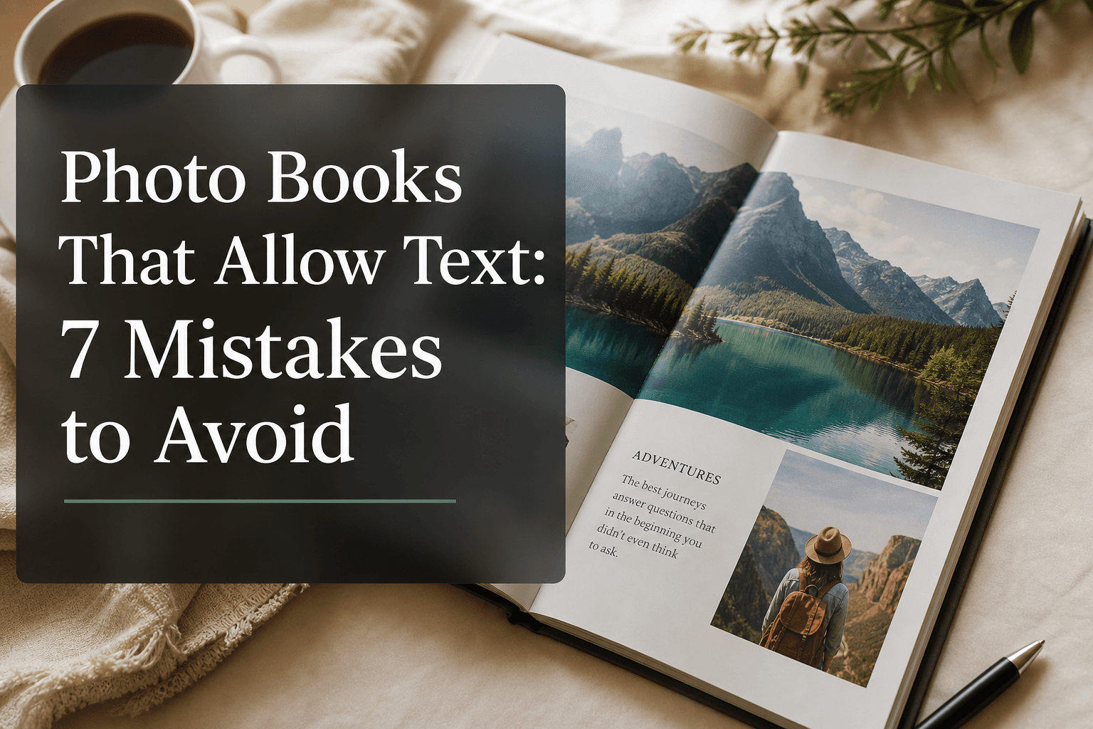
Photo9 Marketing Team
12 min read · Thu May 14 2026
If you’re searching for photo books that allow text, you’re probably not just looking for a place to upload pictures. You want to tell a story. You want names, dates, little notes, inside jokes, travel memories, baby milestones, wedding vows, or the one sentence that makes a photo mean even more.
That’s where many people get stuck.
A photo book can be filled with beautiful images and still feel unfinished if the text is hard to read, too generic, badly placed, or simply missing. And if you don’t have design experience, it’s easy to end up with cluttered pages, tiny fonts, awkward spacing, or captions that compete with your photos instead of enhancing them.
The good news: these mistakes are easy to avoid once you know what to look for.
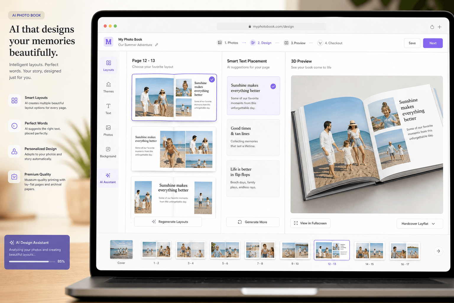
At Photo9, we believe creating polished, personal photo books should feel simple. Our browser-based platform uses AI-generated layouts in seconds, gives you multiple smart layout options for every page, and lets you add text, backgrounds, and finishing touches without wrestling with complicated design tools or downloading an app. The result is a professional-looking photo book that still feels uniquely yours.
What the Best Competitor Articles Get Right - and What They Miss
Top-ranking photo book advice from brands like Popsa, Mixbook, and MILK Books tends to repeat a few smart themes:
Use fewer photos
Avoid low-resolution images
Keep layouts clean
Add captions
Follow a theme
Proofread before ordering
That advice is solid. But there’s a gap.
Most articles talk about photo book mistakes in general, while very few go deep on the specific problems people face with text-enabled photo books. They rarely explain how typography, caption strategy, line length, text contrast, page hierarchy, and text placement affect the final result.
That matters because people searching for:
photo books where you can add text
photo books that allow text
photo books that you can add text to
photo books you can add text
photo books you can add text to
are looking for more than a standard album. They want a product that combines storytelling and design without becoming overwhelming.
This guide focuses exactly on that.
Why Text Can Make a Photo Book Better
Photos capture the moment. Text preserves the meaning.
A good sentence can answer the things your future self may forget:
Where was this taken?
Who is in the photo?
Why did this moment matter?
What happened right before or after?
What did it feel like?
Text transforms a nice photo book into a richer keepsake, gift, or family heirloom.
"Research indicates that the optimal line length for body text is between 50 and 75 characters, including spaces." - Baymard Institute
That kind of readability principle matters in print, too. If your text is too wide, too dense, or too small, people simply won’t enjoy reading it.
"In 2024, approximately 50% of Gen Z and millennial consumers in the U.S. indicated they were more likely to purchase or give personalized gifts during the holiday season compared to the previous year." - Statista
That’s one reason text-based photo books are so powerful: they feel deeply personal, whether you’re making a baby book, wedding album, travel journal, anniversary gift, graduation keepsake, or a family year-in-review.
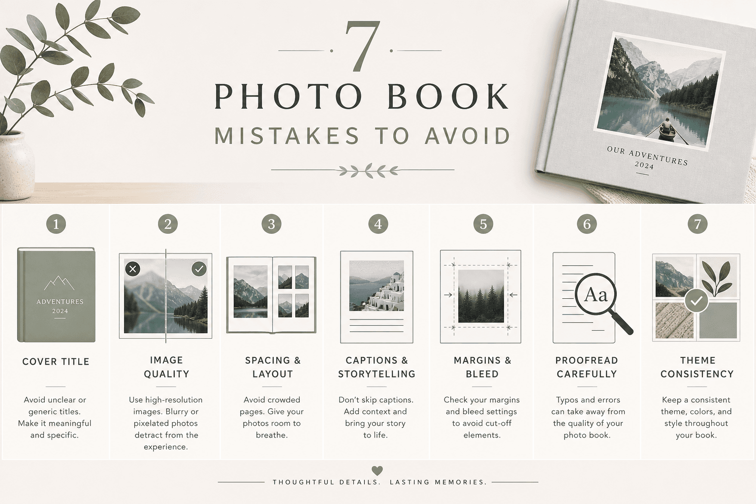
The 7 Most Common Mistakes to Avoid in Photo Books That Allow Text
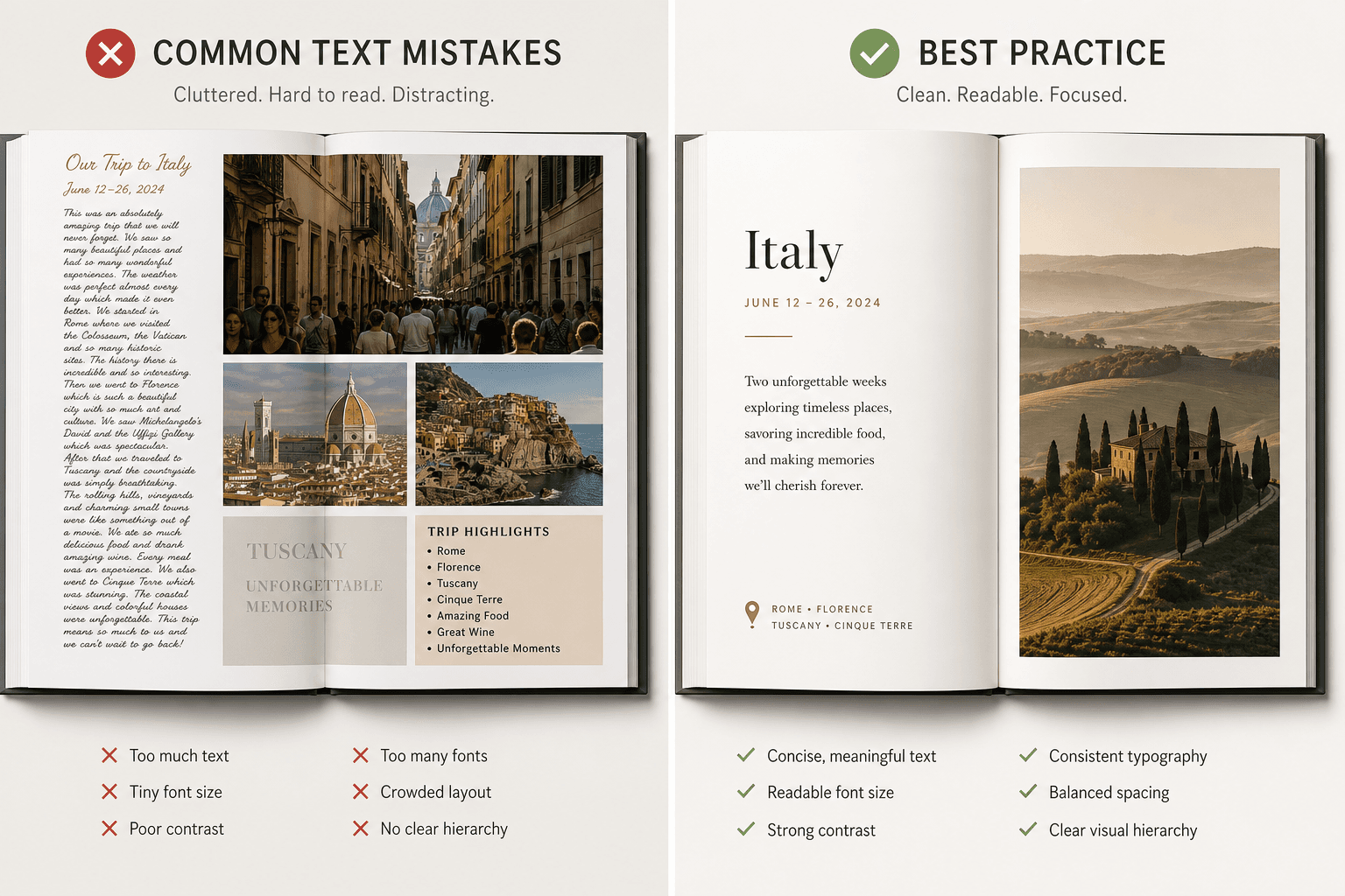
1. Adding Too Much Text to Every Page
One of the biggest mistakes people make with photo books that allow text is assuming every image needs a full explanation.
It doesn’t.
If every page includes multiple paragraphs, your photo book starts to feel more like a scrapbook essay than a polished visual story. Readers don’t know where to look first, and the emotional impact of the images gets diluted.
What to do instead
Use text selectively:
Add short captions for context
Use one longer note on key pages
Let some spreads breathe with image-only layouts
Reserve journaling-style text for especially meaningful moments
A good rule: if the text is repeating what the image already says, shorten it.
Better text examples
Weak caption | Better caption |
|---|---|
Beach trip | Cornwall, July 2025 - windy, cold, perfect anyway |
Baby smiling | Noah, 8 weeks old, already charming everyone |
Dinner out | First night in Rome, after 14,000 steps and zero regrets |
At Photo9, this is easier because the interface gives you multiple layout options for each page, so you can quickly choose between image-led, caption-led, or balanced compositions instead of forcing too much into one design.
2. Using Fonts That Are Too Small, Fancy, or Hard to Read
Text should support the story, not make the reader work for it.
Overly decorative fonts, tiny captions, all-caps paragraphs, or low-contrast type can make your photo book feel less premium - even if the photos themselves are beautiful.
Common typography mistakes
Fonts that look elegant on screen but print poorly
Caption text that is too small
Script fonts used for long paragraphs
Too many font styles in one book
White text placed over bright or busy images
Best practices for readable photo book text
Use no more than 2 font styles
Choose clean, readable body text
Keep decorative fonts for titles only
Make sure text contrast is high
Keep line length comfortable and scannable
Simple font hierarchy that works
Text type | Recommended style |
|---|---|
Cover title | Elegant display or serif font |
Section heading | Clear serif or sans-serif |
Caption | Clean sans-serif or readable serif |
Longer note | Highly readable, medium-sized font |
If you want a premium result without design stress, Photo9’s smart layout suggestions help keep text placement more balanced from the start, so you’re not manually adjusting every text box.
3. Overcrowding the Page with Photos and Text Together
This is where many text-friendly photo books go wrong.
People want to include lots of memories, so they pack in six photos, three captions, a title, a quote, and decorative elements all on one spread. Instead of feeling meaningful, the page feels cramped.
Signs your page is overcrowded
Text overlaps important image details
There’s no white space
Captions feel squeezed in
Multiple photos compete for attention
The spread feels busy at first glance
What to do instead
Think of each spread as having one priority:
a hero image
a photo sequence
a story moment
a quote or dedication
Let one element lead.
Some of the best photo books mix:
full-bleed spreads
one-photo pages
simple two- or three-image layouts
occasional caption pages
This creates rhythm and helps the story flow.
Photo9 is especially useful here because its AI layouts generate in seconds and offer different page arrangements automatically, helping you spot when a page needs more breathing room before you order.
4. Writing Captions That Are Too Vague - or Skipping Them Completely
A lot of people either under-caption or over-caption.
They write something generic like “Summer fun” or they skip text entirely, assuming they’ll always remember the context. But years later, many details fade.
Why captions matter
A strong caption adds:
location
time
people
emotional context
a memorable detail
The best captions are short and specific
Try this formula:
Place + date + detail
Examples:
Paris, April 2024 - the café we went back to three times
Mia’s first day of school, September 2025
Dad’s 60th birthday - right before the surprise toast
Copenhagen, 11 pm, still light outside
When to use longer text
Use a longer paragraph only when:
introducing a chapter
telling a story behind a milestone
including a personal message
creating a dedication or letter
A polished book doesn’t need captions everywhere. It needs them in the right places.
5. Ignoring Margins, Safe Zones, and the Fold
Even beautifully written text can be ruined if it’s placed too close to the edge or too deep into the center of the spread.
This is one of the least discussed mistakes in competitor articles, but it’s especially important for books with text.
What can go wrong
Names or dates get trimmed near the edges
Sentences disappear into the binding
Captions feel visually off-balance
Important text gets lost in full-bleed layouts
Safe placement tips
Keep body text away from the center fold
Avoid placing captions over seams
Don’t place essential words too close to trim edges
Use blank space intentionally around text
If you’re designing a panoramic spread, be extra careful with text placement. A beautiful landscape can cross the center. A sentence usually shouldn’t.
Photo9 helps reduce this risk with smart layout logic, 3D preview, and a workflow that lets you review your project visually before checkout.
6. Mixing Too Many Styles in One Book
Another common issue with photo books you can add text to is inconsistency.
You start with a minimalist travel journal look. Then halfway through, you switch to playful stickers, bold backgrounds, different fonts, and a completely different tone. The result feels fragmented.
Keep these elements consistent
font pairing
color palette
caption tone
page density
image editing style
background usage
Consistency does not mean boring
You can still add variety through:
alternating image-heavy and text-light spreads
using one recurring heading style
creating section divider pages
using one accent color for dates or locations
This is where AI can save time without flattening creativity. Photo9 gives you professionally structured starting points, then lets you customize the final result. So you get cohesion without feeling locked into a rigid template.
7. Forgetting to Proofread Before Ordering
This is the mistake that hurts the most because it’s so preventable.
Once your book is printed, spelling errors, missing names, awkward line breaks, duplicate captions, and incorrect dates become permanent.
What to check before ordering
spelling of names and places
date accuracy
punctuation consistency
font size consistency
text alignment
cropped photos behind text
duplicated or empty text boxes
A fast final review checklist
Checkpoint | Why it matters |
|---|---|
Read every caption aloud | Helps catch awkward phrasing |
Check dates in sequence | Prevents timeline errors |
Zoom in on text pages | Ensures readability |
Review full spreads, not just pages | Confirms visual balance |
Use 3D preview if available | Helps spot print issues before purchase |
With Photo9, that final check is smoother because you can design online, access your project across devices, and use the 3D preview to review the book more realistically before printing.
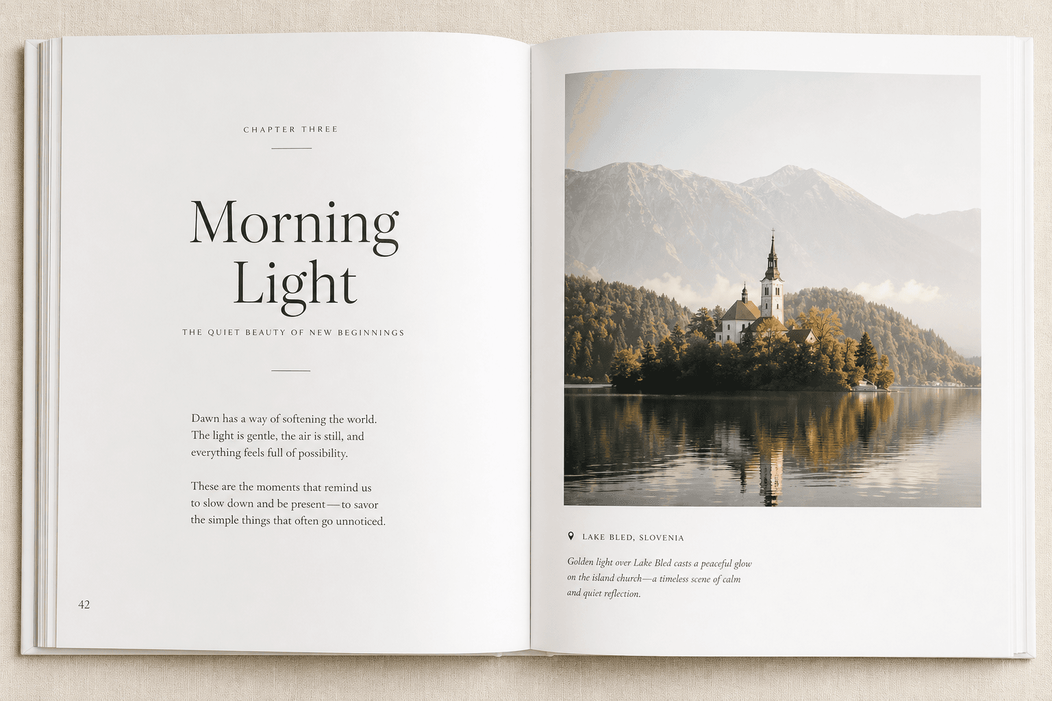
What Great Text-Enabled Photo Books Usually Include
Not every page needs writing, but the best photo books that allow text often include a thoughtful mix of these elements:
Cover title
Intro or dedication page
Short captions under selected photos
Dates and locations
Section dividers
Quotes
Milestone notes
Closing message or reflection
A Simple Formula for a Beautiful Photo Book With Text
If you want a reliable structure, follow this framework:
Opening
Title page
Short introduction or dedication
Middle
Mostly image-led spreads
Selected captions for context
Occasional full-text moment for emotional depth
Ending
Final reflection
Closing quote or note
Optional date/location recap
This approach works especially well for:
baby books
wedding albums
travel photo books
anniversary gifts
family yearbooks
graduation books
memorial and legacy books
How Photo9 Makes It Easier to Create Photo Books With Text
If you’ve ever abandoned a photo book project because it took too long, felt too technical, or looked amateur, you’re not alone.
Photo9 is built to remove exactly those friction points.
Why it feels easier
AI-generated layouts in seconds
Multiple layout options for each page
No app required
Professional-looking design without design experience
Easy text additions, backgrounds, and simple customizations
3D preview before ordering
Access across devices
Smart layout suggestions based on your photos
Premium materials and high print quality
Fast, reliable delivery
Secure payment
100% satisfaction guarantee
Local printing where possible for lower emissions
FSC-certified materials and recyclable packaging
That combination matters. It means you can start with automation, then personalize the result - instead of spending hours dragging, resizing, and second-guessing every page.
Photo9 vs Traditional DIY Photo Book Building
Feature | Traditional manual builder | Photo9 |
|---|---|---|
Layout creation | Manual drag-and-drop | AI-generated in seconds |
Text placement | Often fully manual | Smart starting points and easy editing |
Design experience needed | Moderate to high | Low |
Device flexibility | Sometimes limited | Cross-device access |
Preview quality | Standard flat preview | 3D preview |
Speed | Time-consuming | Fast |
Sustainability focus | Varies | Local production, FSC materials, recyclable packaging |
Final result | Depends heavily on user skill | Professional-looking, easily customizable |
Tips for Different Types of Text-Based Photo Books
For baby books
Keep captions milestone-based: first smile, first trip, first birthday, nicknames, and little observations you may forget later.
For wedding books
Use sparing, elegant text: vows excerpt, wedding date, location, thank-you note, or a short story about the day.
For travel books
Prioritize locations, dates, and one memorable detail from each stop. Avoid turning every page into a diary entry.
For family yearbooks
Use month markers, names, holiday notes, and simple summaries of everyday life.
For gifts
Personal messages work best when they are sincere and short. A few lines on the opening or closing page can carry more emotional weight than paragraphs throughout.
The Best Mindset: Designed, Not Overdesigned
A successful photo book feels intentional.
That doesn’t mean every detail has to be perfect. It means each choice supports the story:
enough text to add meaning
enough space to let images shine
enough consistency to feel polished
enough flexibility to feel personal
That balance is what turns a simple product into a keepsake.
Final Verdict
If you want photo books where you can add text, the goal isn’t just to find a tool with a text box. The goal is to create something that looks clean, reads beautifully, and preserves your memories with warmth and clarity.
Avoid these 7 mistakes:
Adding too much text
Choosing hard-to-read fonts
Overcrowding pages
Writing vague captions or none at all
Ignoring margins and folds
Mixing too many styles
Skipping the proofreading step
When done well, text makes your photo book more personal, more emotional, and more memorable.
And if you want the process to feel fast, intuitive, and genuinely enjoyable, Photo9 gives you a smarter starting point. With AI layouts, multiple page options, easy text customization, 3D preview, and premium print quality, you can create a polished, meaningful book in minutes - not hours.
If you’re ready to turn digital memories into something lasting, Photo9 is one of the easiest and most modern ways to do it.
FAQ
What are common photobook mistakes?
Common mistakes include using too many photos, overcrowding pages, choosing hard-to-read fonts, skipping captions, placing text too close to the fold, and forgetting to proofread. In text-friendly photo books, readability and spacing are just as important as image quality.
Is Popsa or Mixbook better?
Both are well-known options, but they focus largely on traditional photo book creation workflows. If you want a faster, more modern experience with AI-generated layouts, multiple page options, no app requirement, and easy text customization, Photo9 offers a strong alternative.
Which company makes the best quality photo books?
The best choice depends on both print quality and ease of design. Photo9 stands out by combining premium materials, high-quality printing, smart AI layout suggestions, sustainable production choices, and a 100% satisfaction guarantee.
What are the best books that combine words and pictures?
The best ones balance strong visuals with short, meaningful text. Travel books, wedding albums, baby books, family yearbooks, and gift books all work beautifully when captions, dates, and short personal notes are used with restraint.
What are the 7 rules of photography?
While there are many creative guidelines, common “rules” include composition, lighting, focus, framing, depth, timing, and storytelling. In a photo book, storytelling matters most because your layout and captions help connect each image into a memorable narrative.
Which photobook is easiest to use?
The easiest photobook platform is one that removes manual design work while still giving you control. Photo9 is designed for simplicity with AI layouts in seconds, multiple layout choices per page, browser-based editing, 3D preview, and cross-device access.